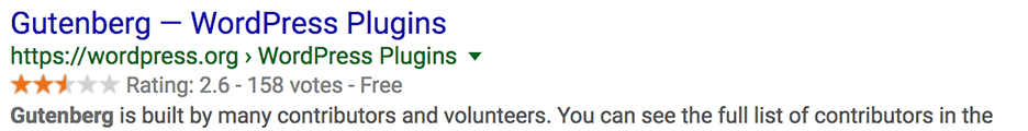
When WordPress launched the Gutenberg blocks plugin the bugs were plentiful and features minimal. The long running WYSIWYG editor, while stable and consistent, offered very little in the way of layout and dozens of 3rd party layout editors sprang up to bring more visual layout to WordPress’ otherwise powerful administration. Now, 5 years later, being able to bundle paragraphs, headers, images, and many more blocks into reusable patterns and templates is better than any of the other CMSs we work with (and better than the 3rd party WordPress alternatives.) Patterns, made from blocks, are powerful for not only for developers, allowing easier site building, but also for clients, allowing better working layouts that are flexible and reusable.
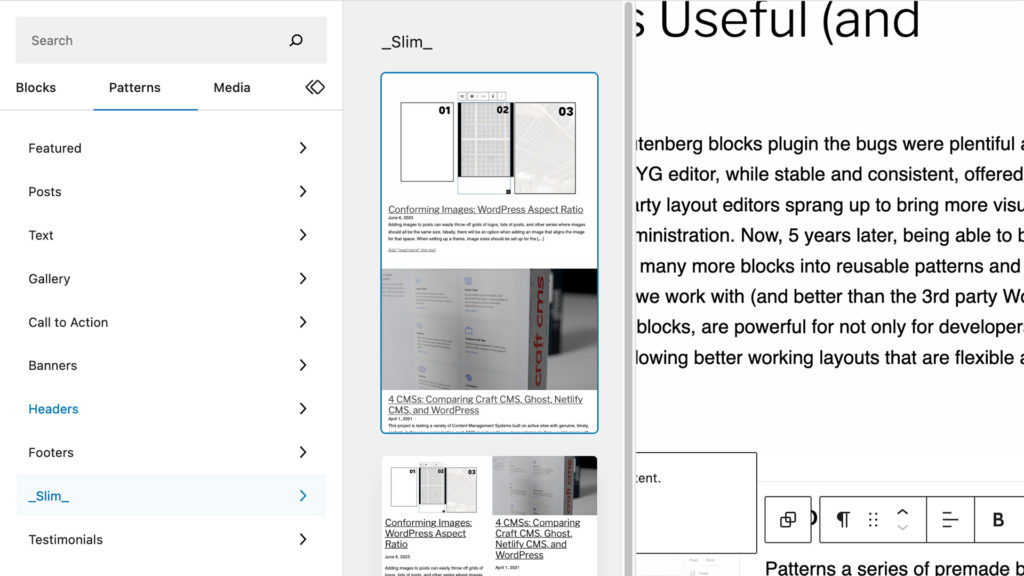
Choosing Premade Patterns
Patterns a series of premade block arrangements that bundle both design and functionality. This reusability is a awesome for developers, who are often tasked with recreating previously developed functionality, and designers, who are desperate to maintain layout and branding integrity.
Building a Block Pattern Right in the Editor
Being able to build a comprehensive and transportable layout in WordPress is one of the best and most unique features of Blocks. (The editor isn’t often referred to as Gutenberg outside the plugin.) With the other CMSs we are testing there doesn’t seem to be an easy way to build, copy then paste, and save as either code or “setting” the same way as WordPress can.
Options in Craft CMS, Ghost, and Decap CMS
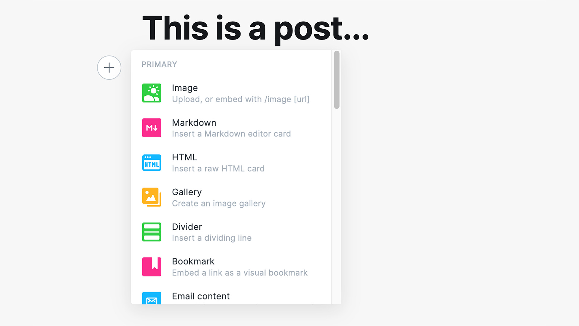
SquareSpace put the most pressure on WordPress to change their editing but there are many more CMSs (thankfully) and many more self-hosted options. So far, we haven’t seen quite the level of ease of editing, ease of repeatability, and design “friendliness” as close to the WordPress’ block editor. There are block possibilities, such as the Matrix block in Craft CMS, but they aren’t quite as easy to create and do require some level of coding to implement.
Now invaluable for quick comprehensive editing.
WordPress Blocks are, fortunately, an example of a rough initial launch being smoothed out with continual steady progress. Blocks aren’t perfect, far from it, but compared to standard WYSIWYG editing, they are an enormous step forward.
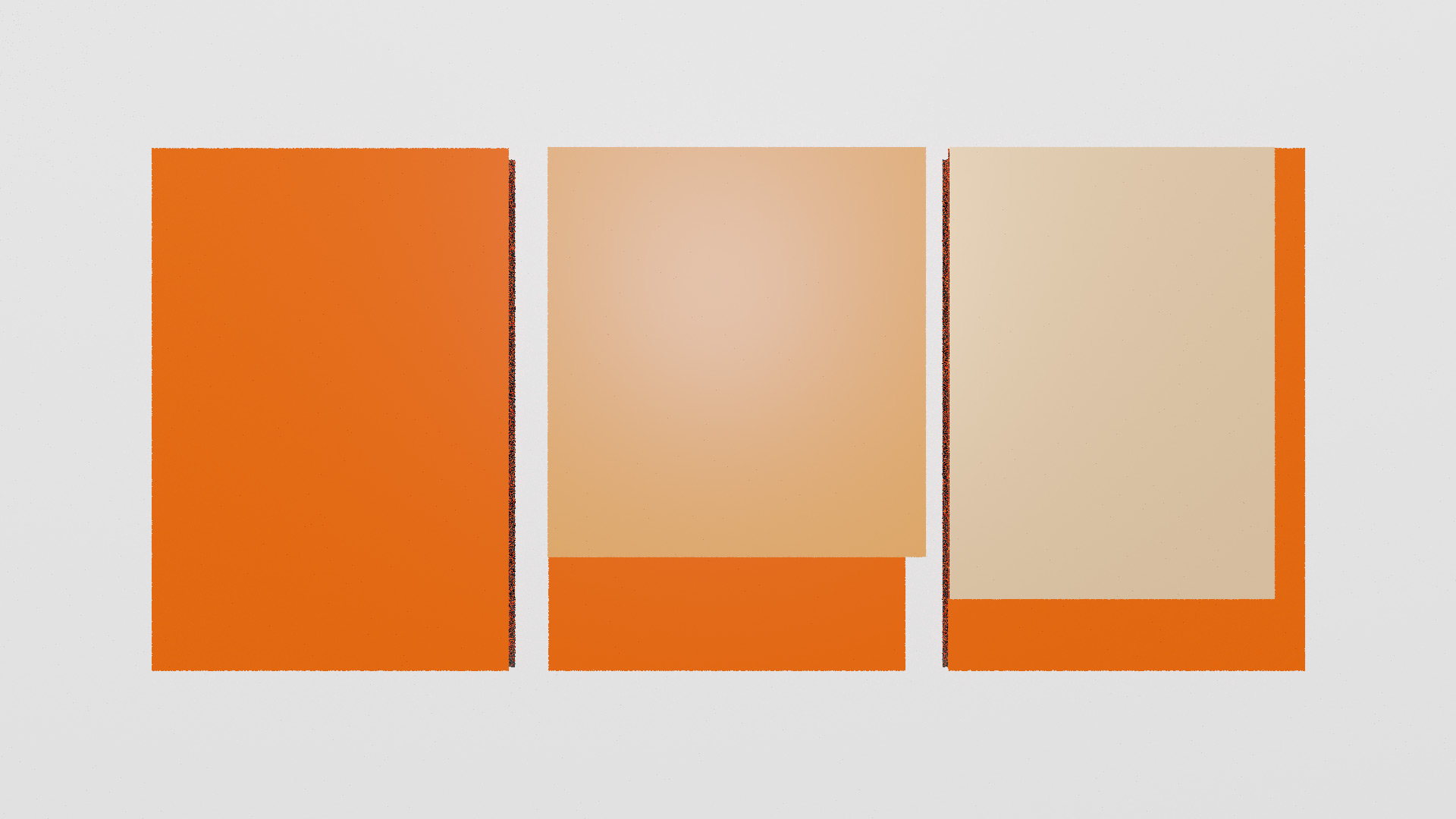
Adding images to posts can easily throw off grids of logos, lists of posts, and other series where images should all be the same size. Ideally, there will be an option when adding an image that aligns the image for that space. When setting up a theme, image sizes should be set up for the various areas but it does need to either be coded or configured with a plugin. These settings need some finesse as well. While a large enough image will always enable the options needed, if cropping is not enabled, the image will still throw off the layout. Also, if an image is too small (or just right which is tricky,) the right options won’t show at all. Let’s look at how this should work.
Selecting an Image for a Space
We have a 3 column grid with a default image filling out each of the spaces. When uploading a new image, we see that this new image isn’t following the aspect ratio that is set up. For the technically minded, the original images are 600 by 900 pixels or 2:3 and the new image is 750 by 1000 pixels or 3:4. WordPress can work with an odd shaped images but sometimes there are compromises.
Custom Image Sizes
There are default image sizes, small at 150 by 150 pixels, medium 300 by 300 pixels, and large 1024 by 1024 pixels that can work in body text areas but design elements will likely need specific sizes noted by a designer. With our 3 column design, we have custom image tall size that is 600 by 900 to make the design.
Custom images needed for a design like this should be added to the theme settings to get the right effect. When uploading a large image, we should see an option to scale the image down. Here we have cropped and uncropped options that show how images are conformed if an uploaded image is larger than a needed space.
Cropping After Uploading
Uploading images larger than a needed space (using our 600 by 900 grid example) is common but there are 2 ways WordPress conforms images either cropped or uncropped. If a size is set to cropped then WordPress will trim the largest dimension down to fit the image to the aspect ratio.
Our too large image, 750 by 1000, becomes 667 by 1000 to fit the 2:3 aspect ratio needed. The uncropped image stays the odd ratio of 3:4 and even enlarging the image doesn’t work since the extra width spills over the space. If an image, like the 04 example, is too large, but the same aspect ratio, it fits in the space regardless of what size is chosen. Choosing the right size will optimize the loading of the page instead of loading a high resolution image.
This project is testing a variety of Content Management Systems built on active sites with genuine, timely, content. In this way, we are testing each CMS in real world use, more extensively than would happen with just demo or “filler” content. Beginning with version WordPress 2.3, nearly 10 years ago, we started building by building WordPress sites using custom themes. Many of these information WordPress sites continue to be used today with minimal theme changes.
Since then though, our WordPress focus has shifted to more extensive WooCommerce installs, custom API construction and connection, and fully custom plugins. We continue to build some simple informational sites but the development landscape has drastically changed since WordPress’ early years. WordPress started as one of the only stable, actively updated content management systems. Now there many mature options including; Ghost a publication focused system, Netlify a platform for static sites that also includes a simple CMS, or Craft CMS which can work with widely flexible content.
Starting Point
To explore all these new options, we’ve setup 3 example sites based on a variety of current topics, Automation, the Green New Deal, and the Shapes and Screens of modern computing; these topics will provide endless angles from which to create media and content. We then started building a universal theme to use across each of the the CMSs, the theme isn’t pretty yet but sets a level starting place.
Are these CMS fair to compare to each other?
These CMSs are not directly comparable. For one, WordPress is often bundled right on many hosting platforms. Positioned as a “default” option, WordPress has near endless application. Each of these site managers is more difficult to set up and get going. However, even if they aren’t directly comparable, we are starting each with a simple publishing base. Each site should be able to have a customizable homepage, leading to list of posts, and individual posts should have layout options for images and other media. Ideally, getting started building these on an Nginx platform shouldn’t be difficult. (Also each site has to work locally, more on that later.)
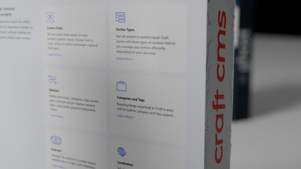
Craft CMS
Craft’s feature types are key the flexible content management of the system.
Craft CMS is often compared to WordPress as both are run on PHP. Our setup on localhost was downloaded from the community version. At the moment, Craft needs the database information entered in code, not a browser, but overall installation was straightforward. From there, setting up the sections and entries to make the blog took some work wasn’t difficult. Our main critique is that there should be placeholder content and set up that helps users get started with a blog or simple information site. Craft CMS has been more difficult to update though, we are seeing a PHP issue that isn’t obvious to resolve. We’ll definitely have a follow post on updates for each CMS.
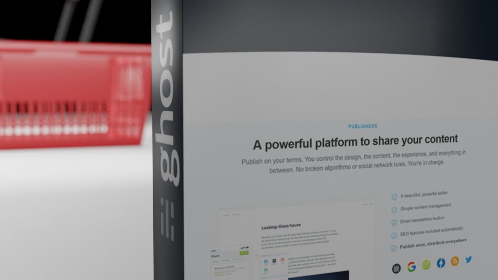
Ghost
Ghost has total focus on publishing.
From install to content creation, Ghost has an elegant interface and keeps clutter to an absolute minimum. Ghost has a paid option but installing the standalone system can be done from the command line and is built in the speedy, straightforward Node.js. With no database to setup, Ghost is self-contained and setup was a breeze on the local and remote servers. The complexity with Ghost came in editing the template, which needs a restart to show the edits. Overall though, Ghost startup and early management is the easiest.
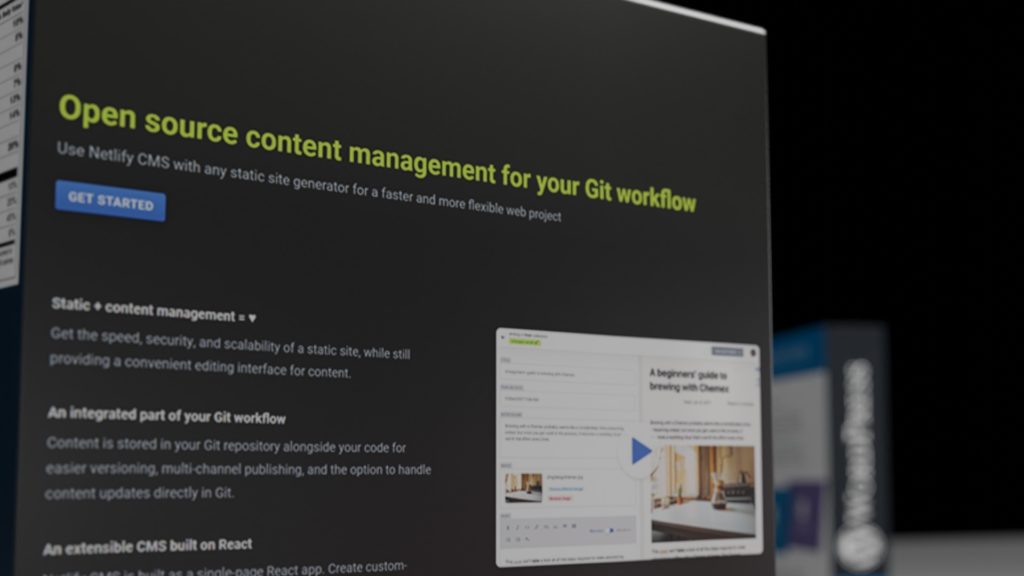
Netlify with the Hugo Starter
Ghost has total focus on publishing.
Netlify CMS is the outlier in the group. Not only does Netlify CMS run as a static HTML site, the others are complied when a user visits or “time-of-flight,” but also Netlify is known more for it’s CDN infrastructure than for it’s CMS. Hosting the static site on a shared server removes the advantages of using the whole CDN but we’ll explore hosting options in the future. While many CMSs can output somewhat “static,” Netlify is purpose built and leans on Git versioning for content. This developer focus is appreciated, but is unlikely to be used by an “average” site creator.
Right now all the sites are set up and we are actively publishing content for each. First, we’ll dig into how post writing and publishing works. Stay tuned!
(Originally published in October 2020. Modified and republished February 2021.)
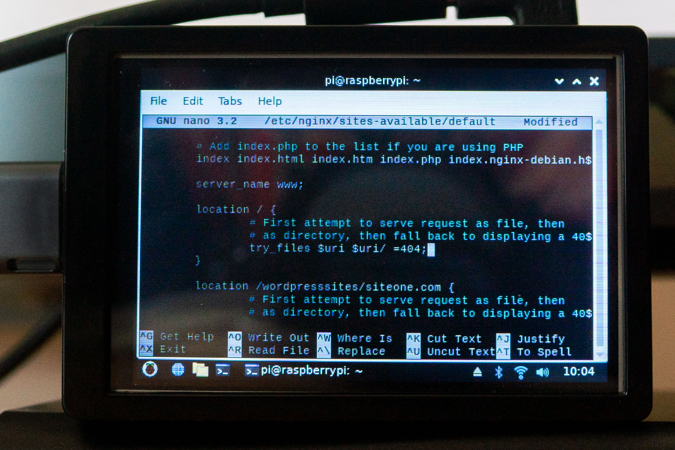
Nginx is not only a fast server for single production sites but also a robust development server, with the right settings. With a default Nginx install, the /etc/nginx/sites-available/default serves overall index files for folders but doesn’t resolve queries to dynamic files. To fix this, create locations for each dynamic site.
The default Nginx file linked here with all the important pieces, port declaration, root, index files, and locations. Locations are where Nginx resolves browse requests for files in the targeted folder (in this case the root /). The examples on the Nginx page, don’t offer too much context about how various methods can work.
Locations standard code
	location / {
		# First attempt to serve request as file, then
		# as directory, then fall back to displaying a 404.
		try_files $uri $uri/ =404;
	}
With just the try_files $uri, the server only resolves to files directly in the browser URL and that’s it, limiting most modern CMSs. These location sections function similar to Apache’s .htaccess files so we need a directive that properly targets WordPress’ startup index.php for queries. (Here, all the directives are in one place though.)
Often when serving multiple CMSs on Nginx multiple config files will be added to sites-available (and linked in sites-enabled) but in this case we aren’t really making multiple sites so much as enabling the same CMS in multiple directories. When testing, the easiest method was to add one location section for each WordPress install using the syntax below.
Locations for Dynamic Sites (without needing multiple server blocks)
	location /wordpresssites/siteone.com {
		# First attempt to serve request as file or
		# serve from the WordPress startup file, then
		# as directory, then fall back to displaying a 404.
		try_files $uri $uri/ /wordpresssites/siteone.com/index.php?q=$uri$args;
	}
In this way, when navigating to http://localhost/wordpresssites/siteone.com the server resolves requests to the index.php as expected. Want to setup multiple WordPress sites? Or another PHP CMS? Just copy the section and rename as needed. Make sure to restart Nginx!
sudo service nginx restart
or
sudo systemctl status nginx
Have another way of approaching these directives? Comment below!
After a long battle, many many yarns later, it turned out that trying to get CK Editor to work in an older version of React Scripts, as an example, was far too much work. What’s more, there aren’t too many barriers in moving from React Scripts 1 to version 2. Some of the Routing syntax has changed but overall a build using forms, axios, mammoth, and a few other common repos, switched with minimal effort and no feature loss (or replacement.)
This came about when trying to build an older repo with the newest CK Editor, 5. The error shown right away is:
Failed to minify the code from this file: [31/75] <project_root>/node_modules/@ckeditor/ckeditor5-build-classic/build/ckeditor.js:5:2077
The directions provided by CKEditor are to eject the app, which is lasting and a huge pain, so instead React App Rewired looked like an option. After more than a few attempts, including duplicating and ejecting a backup repo, no amount of config overriding looked to get the editor to build in React Scripts v1.
This took, admittedly, hours to try and hack around only to hit more JS that refused to compile.
Updating the dependencies to React 2.1.8 and, after a couple more yarn updates, the build went right through. Done. No hacks, no weird shoehorning of ES5 into a largely ES6 build.
Ejecting should be a very last ditch effort for trying to get any repo that may not support the latest scripts version and while overrides are absolutely helpful in tweaking settings, they can’t redirect a whole build. Also, don’t eject React (this has been well covered.)
Two-Factor Authentication is an additional step in signing into social media, applications, or websites using rotating randomly generated codes. At first, the added layer might seem time consuming and even unnecessary but it can actually save time and make collaboration easier, in addition to adding security. This layer of security also might seem technical or excessive but everyone should use it for every service that has it available. In particular, we use two-factor for any service that doesn’t have multiple users and for social media accounts that are often targets for “drive-by” intruders.
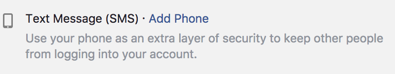
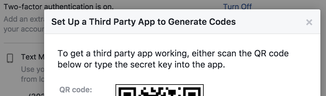
The one pitfall for two-factor is the setup. There are 2 main ways to setup and get the codes, via text message SMS or through an app such as Google Authenticator; both options have issues.
Facebook version of Two-Factor via SMS.
SMS can be convenient, especially with messages available on multiple devices, but an app is preferred if many accounts are being handled, as shown in the examples.
Facebook version of Two-Factor via QR Codes.
The app is the better direction because it’s not tied to a single phone number which can make using multiple phones or systems difficult. To make sure you can use multiple devices with an app, save the QR code (securely!) that is used to setup, so you can add multiple devices including a phone, tablet, or laptop.
As example here are the two-factor steps for CloudFlare:
Getting to the security page is the first step. Services like Facebook have usually have this option bundled with other security settings but CloudFlare's is on the profile page: https://www.cloudflare.com/a/profile
Next the service will either offer both SMS and a QR code or one of the options. As mentioned, QR codes are slightly easier but save the QR code securely!
Open your authenticator on your phone or tablet and put the camera over to sync up. (There is also usually an option to type a code in also.)
Last, when the service is added, you’ll confirm by typing in the first random code a first time.
How does two-factor authentication save time?
Even if you don’t enable two-factor, services like Facebook and CloudFlare will often email you to double check your login randomly, if logging in from a new location or from a new device. You can avoid this random check with the two-factor. Also, if you’re sharing access to accounts without multiple users, you can use two-factor to avoid this check when others are logging into the account. Last, most importantly, the extra security could be what saves the immense headache of cleaning up after an intruder as gotten access to important accounts.
Two-factor is important for collaboration, shared accounts or individual.
As mentioned above, two-factor avoids a service emailing to confirm a login, which avoids the inconvenience of an email conformation. If there are multiple users for an account though, thereoften isn’t password consistency so having two-factor on each account at least enforces a random level of security backing up a potentially insecure user password.
Must must must use for social media, but steadily add every service that you login into regularly.
Next to financial sites, or cloud password managers, social media sites are becoming go to easy targets for hackers as they are gateways to other services. For example, to log into Buffer, you may use Twitter. If your Twitter is compromised, so to is your Buffer account. In fact, once you have two-factor set up, keep an eye on connected accounts also since they can sometimes bypass logins altogether.
Although it adds a little more setup time, keep in mind all the benefits of adding two-factor authentication including the primary goal of added security. To make this a habit, have a process of generating and saving a secure password, backup code, and connecting QR code when you set up a new service. Like other habits, the early effort adding two-factor will save a ton of time later down the road.
Heroku is a platform that enables developers to “build, run, and operate applications.” The way Heroku hosting is managed is both more complex yet with fewer standard features than more consumer focused cPanels, control panels, commonly found for shared website hosting. The platform has a modular setup allowing for plug in of databases, caching, load balancers, and more. Also, adding additional apps, different instances of the site, and arranging them in a pipeline is as easy as adding additional domains in cPanels. Last, open ended environmental variables are available to edit where other website managers would only show settings for simple packaged features such as site databases (maybe even calling them the more technical MySQL databases.)
All of this said, there’s nothing concrete stopping the hosting of a website on Heroku’s platform, even if it is a bit tricky.
Though most of the sites we have are on standard cPanels, we do have a few sites hosted on Heroku. Some of the sites are on Node.js based Content Management Systems, some on Ruby based CMSs. Some of the features are very welcome such as the pipeline configuration, which allows for a seamless development arrangement that is harder to make on a standard shared host. Since Heroku is targeted towards developers, it’s welcome to see these features well thought though.
Most of the pitfalls with the hosting so far are fairly straightforward; don’t have too many virtual instances using the same database, caching needs a careful eye since clients may connect to different instances, and there is a plugin or module for nearly everything but they need some wrangling.
As we build on the sites, it’s a good to compare against the other sites we host, and see how viable sites of different sizes are on Heroku.
Managing content and managing code are surprisingly similar. However, where content management and creation can be more freeform, coders are forced into a number of standard practices by the collaborative nature of modern coding.
Even when working alone, coders rarely start from scratch often building off ongoing projects such as frameworks or libraries. This collaboration is also asynchronous since various interconnected pieces of projects are being worked on by different coders at different times.
Because of these unique conditions, coders have adapted a few techniques that can be helpful both for teams of content creators and those working alone. The more standout techniques are standardized file and folder organization, index files, and versioning. Each of these techniques are starting to show up in content management and creation but they aren’t always obvious or easy to implement.
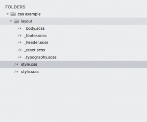
Standard folders. Collection files.
File and folder organization are crucial for coders, even for those few sites without Content Management Systems. The most simple of websites, such as 1 page landing page sites, can have dozens or hundreds of files. It might seem like a paradox, but websites with more files are often more organized.
Recently, there has been an effort bundle common files together, break out larger files into smaller pieces then reference these files in one index file. Indexes and outlines aren’t new to content of course but coding as put a new spin on them.
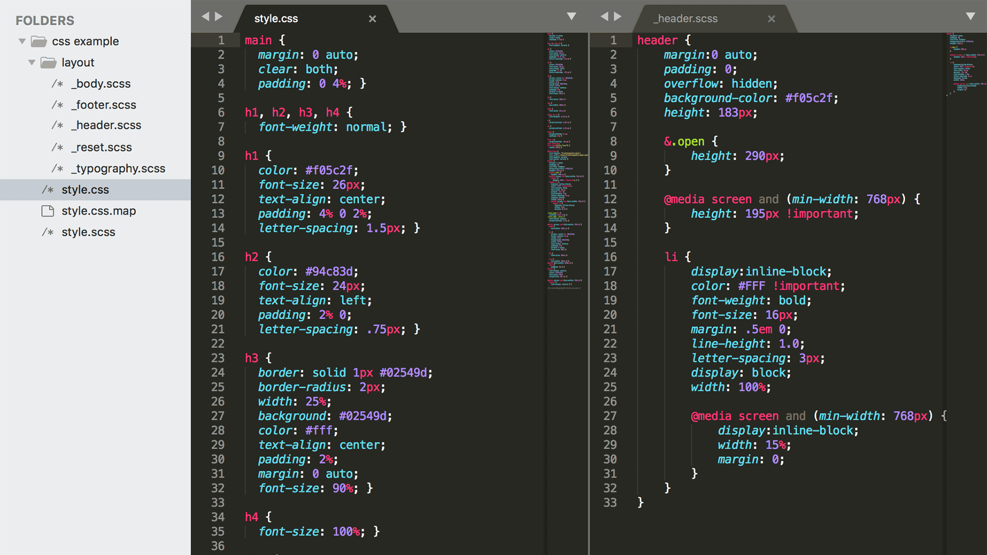
Let’s take a comparison of a document in InDesign and a CSS file. CSS, or Cascading Style Sheet(s), are what lay out HTML sites. Early on, CSS was written as single large sheets but these are cumbersome to build and maintain.
Now, CSS is written as much shorter individual files and grouped into standard folders that are automatically combined just before posting. On the right, the final file that is used is style.css but all of the other files combine into that 1 file before being used.
Programs like InDesign, Google Docs, and Photoshop all allow similar methods of pulling in smaller files, nothing new there, but it’s how the smaller files are referenced and managed that can save time and effort.
Simple structure, bite-size files.
Diving into the contents of the files further reinforces why breaking out files is so important. Looking at the 2 CSS versions to the right, there are more layers to walkthrough but these layers add clarity.
With one massive file, a fair amount of digging and searching is needed. which can take more time and lead to more errors.
Using InDesign as an example again, images can be imported right in the file then the original file discarded. In fact many programs can now embed images or other files instead of linking but this both increases file sizes and makes later editing difficult.
Plan for maintaining not only the main file but also the element files. Combining files right into an layout file might seem convenient but the smaller files aren’t reusable. Reusability is extremely important to code, so much so that nearly every website includes some common code library or framework.
With our example you can go so far as to include InDesign files within InDesign files. It seems ridiculous but this layering keeps the element files very simple. Another huge benefit of breaking out files is the ability to version the files independently.
Versioning. Track, plan, sort.
Versioning is extremely important for coding. Having a clear view of what has changed between different iterations of files, who made the last edit, or just having a history to refer to refer to makes it easier for coders to share, maintain, and reuse code.
Version trackers such as Git are essential to good coding but there isn’t one go to version tracker for content because of the many different tools content creators and editors use. Instead, you need to both look for tools that support version tracking and see what level tracking each tool has.
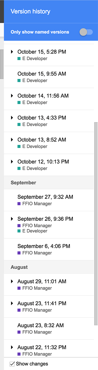
For example, Google Docs recently added excellent version support where each change is reviewable, changes clearly comparable, and a history to follow.
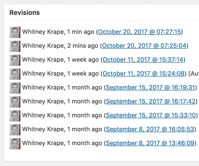
WordPress has some version tracking but only within it’s main content. But these revisions are overlooked too often.
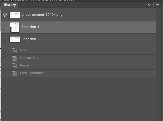
Last Photoshop has a history allows a user to move back and forth in time and even snapshots of time periods but no clear preview. The preview of what content has changed over time is one way of highlighting that can be adapted but there are more ways that we can bring from coding.
Since code is simply text versioning has been standardized with ecosystems built around managing, sharing, and deploying pieces or whole collections of code. However, making similar ecosystems for content is not nearly as easy but if you look around at your existing software, it may have the features you need and you’ll now what to look out for when choosing new options.
In the end.
Standardizing folders is general good practice but it might not happen until your forced into a workflow. As well, getting in the habit of keeping reusable files easily accessible takes some additional time on creation but can pay off enormously when there dozens of projects with various kinds of media to keep track of.
Neither of these take any special software to adapt, coders have just refined them to a nearly seamless degree.
Versioning might be available to you now but it not only takes the right software implementation but also keeping a critical eye out for time when it will save time.
What techniques have you adapted from technical work?
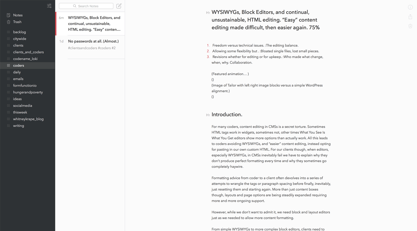
For many coders, content editing in CMSs is a secret torture. Sometimes HTML tags work in widgets, sometimes not, other times What You See Is What You Get editors show more options than actually work. All this leads to coders avoiding WYSIWYGs, and “easier” content editing, instead opting for pasting in our own custom HTML. For our clients though, when editors, especially WYSIWYGs, in CMSs inevitably fail we have to explain why they don’t produce perfect formatting every time and why they sometimes go completely haywire.
Formatting advice from coder to a client often devolves into a series of attempts to wrangle the tags or paragraph spacing before finally, inevitably, just resetting them and starting again. More than just content boxes though, layouts and page options are being steadily expanded requiring more and more ongoing support.
However, while we don’t want to admit it, we need block and layout editors just as we needed to allow more content formatting.
From simple WYSIWYGs to more complex block editors, clients need to have some flexibility to save us time and we can save even more time by allowing the right flexibility in templates. What’s more, we need to maintain our own content without writing custom HTML all the time.
The continual balance between edibility and complete disaster.
Modern CMSs have been around long enough now that editing and posting raw HTML files is archaic. At one time, early website clients simply sent content and it was up to the developer to translate these into usable HTML to post.
Fortunately text to HTML arrived fairly quickly. This has freed up valuable time but also started some tension between clients trying more and more advanced formatting, and the questionable auto generated code from these editors. With complete CMSs now the norm, clients expect much more than simple text formatting in their content management which can lead to a delicate balancing act for site templates.
Imagine though, what if we had to go back to providing formatted HTML for every post and page a client wanted to add.
Reviews of WordPress’ Gutenburg are as much concerns about changing what works as they are about current functionality.
Hyperbolic, sure, but many clients still aren’t able setup their own columns or blocks just yet. Most layouts are predetermined since this avoids both coding and design issues. However, more tools are adding prebuilt content blocks that are flexible as well as reasonably well coded and designed. These tools can free up both valuable developer and designer time if freedom and control are balanced well.
Let out a little slack. (Not give’m enough rope.)
For developers, the main issue with more client editable layouts are when they are used in unexpected ways. Not too long ago, WYSIWYGs had this effect when they power to affect whole page formatting. Fortunately, CMSs, like WordPress, can now contain open tags, keeping them from ruining whole pages, and all-in-one editors, such as Squarespace, often hide the HTML altogether.
What’s more, these all-in-ones have grabbed marketshare by unlocking even more layout potential. Plugins for CMSs like WordPress, Joomla, and Drupal are following suit. Now layouts are being formed into blocks with sections, rows, and columns that would normally be left to carefully constructed HTML and CSS.
These editors in no way replace designers or developers though. Just as prepackaged templates can’t replace carefully planned (re)designs.
Just drag and drop. We wanted to make a fun drag and drop test area but it was taking too long to code.
Overall site layouts and user paths will always need expert and independent viewpoints. But why should developers and designers get bogged down when a client simply needs a few more content block options than were originally developed.
If a design and it’s templates are too locked down then a site’s potential is artificially constrained. So long as element tags are wrangled and overall page layouts are respected, block editors free clients and coders from unnecessary back and forth.
What to say, not how to say it.
Most of all though, if a freelance coder or a smaller developer team wants to put out any content, these editors are a lifesaver. The most common criticism is “CMSs are bloated” which is not unreasonable but it leads to either giving up all layout and formatting for an option like Medium, or using a very stripped down CMS like Ghost for your own content. Worst of all, content might not even get out the door because too much time is spent making then remaking our own sites.
Courtesy of Ghost, the layout is intentionally familiar.
Ghost, with a similar focused writing layout to many note and writing apps.
Bear. Writing, 3 column style.
We guarantee, because we’ve done it, you don’t want to spend as many development hours on your own site as you spend on a client site.
When customizing our own content layouts we can have trouble settling on the design. Refinement turns into constant nit picky development and we end up draining our own resources. It is difficult to give up the power to perfectly adjust our layouts and formatting but it is always better to show off through client work, not a portfolio.
Being more restrictive with clients is reasonable, to avoid cascading issues, but we should know this balance from our own work. If a layout or block editor is difficult or issue causing with your own content than imagine if you handed that to a less technical client.
Perfect < out the door.
At peak frustration, when WYSIWYGs leave tags open or lose formatting for no reason, try and remember how much time you don’t spend formatting and reformatting individual content pages across all the sites you manage.
Then, moving forward, know that block editors will have the same growing pains but also free you from having to predict every single layout a client may need. Most of all, write something of your own down, have fun with the layout without having to code and get it posted it to your site.
Coders might prefer the plain markdown of a readme.md but when you need more elegant formatting and layout, put the content into a CMS even if you just start with a default template. Adding a block editor to a template is a great way to start expand it’s potential. What’s more, some of the best designers and developers have started with default templates, just to get the content out.