Category: WordPress

  • 4 CMSs: WordPress’ Patterns made Blocks Useful (and Unmatched)

    It was a rough start…


    When WordPress launched the Gutenberg blocks plugin the bugs were plentiful and features minimal. The long running WYSIWYG editor, while stable and consistent, offered very little in the way of layout and dozens of 3rd party layout editors sprang up to bring more visual layout to WordPress’ otherwise powerful administration. Now, 5 years later, being able to bundle paragraphs, headers, images, and many more blocks into reusable patterns and templates is better than any of the other CMSs we work with (and better than the 3rd party WordPress alternatives.) Patterns, made from blocks, are powerful for not only for developers, allowing easier site building, but also for clients, allowing better working layouts that are flexible and reusable.

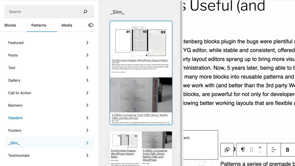
    Choosing Premade Patterns

    Patterns a series of premade block arrangements that bundle both design and functionality. This reusability is a awesome for developers, who are often tasked with recreating previously developed functionality, and designers, who are desperate to maintain layout and branding integrity.

    Building a Block Pattern Right in the Editor

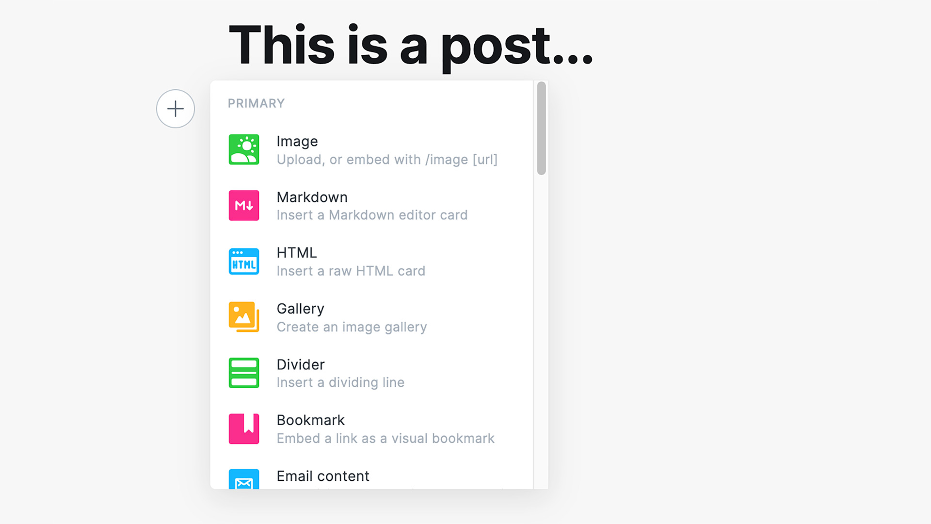
    Being able to build a comprehensive and transportable layout in WordPress is one of the best and most unique features of Blocks. (The editor isn’t often referred to as Gutenberg outside the plugin.) With the other CMSs we are testing there doesn’t seem to be an easy way to build, copy then paste, and save as either code or “setting” the same way as WordPress can.

    Options in Craft CMS, Ghost, and Decap CMS

    SquareSpace put the most pressure on WordPress to change their editing but there are many more CMSs (thankfully) and many more self-hosted options. So far, we haven’t seen quite the level of ease of editing, ease of repeatability, and design “friendliness” as close to the WordPress’ block editor. There are block possibilities, such as the Matrix block in Craft CMS, but they aren’t quite as easy to create and do require some level of coding to implement.

    Now invaluable for quick comprehensive editing.


    WordPress Blocks are, fortunately, an example of a rough initial launch being smoothed out with continual steady progress. Blocks aren’t perfect, far from it, but compared to standard WYSIWYG editing, they are an enormous step forward.

  • Conforming Images: WordPress Aspect Ratio

    Conforming Images: WordPress Aspect Ratio

    Adding images to posts can easily throw off grids of logos, lists of posts, and other series where images should all be the same size. Ideally, there will be an option when adding an image that aligns the image for that space. When setting up a theme, image sizes should be set up for the various areas but it does need to either be coded or configured with a plugin. These settings need some finesse as well. While a large enough image will always enable the options needed, if cropping is not enabled, the image will still throw off the layout. Also, if an image is too small (or just right which is tricky,) the right options won’t show at all. Let’s look at how this should work.

    Selecting an Image for a Space

    We have a 3 column grid with a default image filling out each of the spaces. When uploading a new image, we see that this new image isn’t following the aspect ratio that is set up. For the technically minded, the original images are 600 by 900 pixels or 2:3 and the new image is 750 by 1000 pixels or 3:4. WordPress can work with an odd shaped images but sometimes there are compromises.

    Custom Image Sizes

    There are default image sizes, small at 150 by 150 pixels, medium 300 by 300 pixels, and large 1024 by 1024 pixels that can work in body text areas but design elements will likely need specific sizes noted by a designer. With our 3 column design, we have custom image tall size that is 600 by 900 to make the design.

    Custom images needed for a design like this should be added to the theme settings to get the right effect. When uploading a large image, we should see an option to scale the image down. Here we have cropped and uncropped options that show how images are conformed if an uploaded image is larger than a needed space.

    Cropping After Uploading

    Uploading images larger than a needed space (using our 600 by 900 grid example) is common but there are 2 ways WordPress conforms images either cropped or uncropped. If a size is set to cropped then WordPress will trim the largest dimension down to fit the image to the aspect ratio.

    Our too large image, 750 by 1000, becomes 667 by 1000 to fit the 2:3 aspect ratio needed. The uncropped image stays the odd ratio of 3:4 and even enlarging the image doesn’t work since the extra width spills over the space. If an image, like the 04 example, is too large, but the same aspect ratio, it fits in the space regardless of what size is chosen. Choosing the right size will optimize the loading of the page instead of loading a high resolution image.